
web design
Below is a downloadable pdf of the website design. It includes the sitemap, wireframes, and mockups all annotated explaining the design process.
website pages
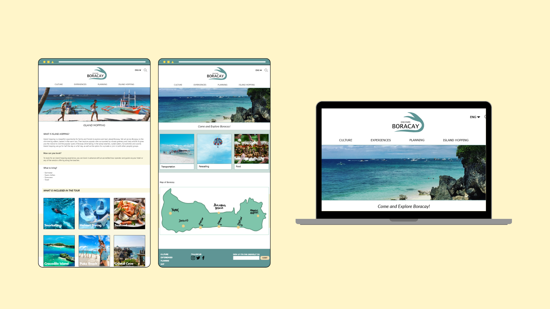
This shows a comparison between the mockup and the prototype. It can be properly read on replit which is free to sign up!

Mockup
Prototype
-
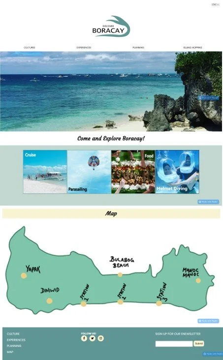
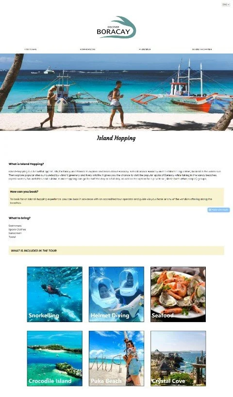
The home page prototype was developed with an easy-to-follow layout, while also providing accessibility and aesthetics.
Overall, the home page prototype is very much the same as the mockup. However, very minor changes were made to add readability and better aesthetics to the page. Firstly, call to action texts and titles such as the ‘Come and Explore Boracay!’ and ‘Map’ were edited by their fonts and positioning. The font was changed to ‘Courgette’ which is a fancy yet easy to read font. This keeps that page balance of keeping content towards the middle. It also adds the envisioned variety and style to the website’s aesthetic which was seen in the website proposal’s moodboard.
Next, the content in the middle was changed to four instead of three as it gives the user more options to explore on the website. The text underneath the photos in the mockup page was changed to sit in the photos, as seen in the prototype. This makes it easier for responsiveness for when the user opens the page on a smaller device. The colour of the ‘Parasailing’ has been edited from white to black text so there is a clear contrast which allows for readability. In the mockup mobile version, there was an issue with contrast as the white text was too light for the image, therefore it was decided to change the text to black.

Mockup
Prototype
-
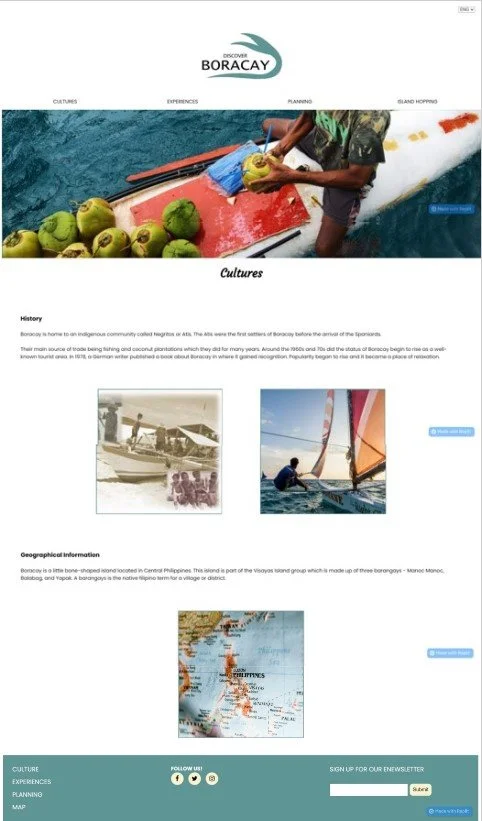
The cultures page was developed to keep its very simple design which still consisted to the colour palette and aesthetic. By doing this, it helps with the user experience and engagement with the website as they understand the website aesthetic and layout. The page also remains to provide the necessary information for users to know. This design remained the same as it considered the user personas from the proposal, in where they wished for a website that was easily available with all the information they needed. There were no changes in terms of layout, engagement, and accessibility as user feedback came back positive. The one change in design was the font of the title ‘Planning’ to courgette. This keeps the same style across all current and upcoming pages.
All images were kept towards the middle with equal spacing to maintain that visual balance across the website. Texts and subheadings were also aligned. This kept the design and look of the page clean and tidy. It also helped with responsiveness for when the page is opened at a smaller window width.
Mockup
Prototype
-
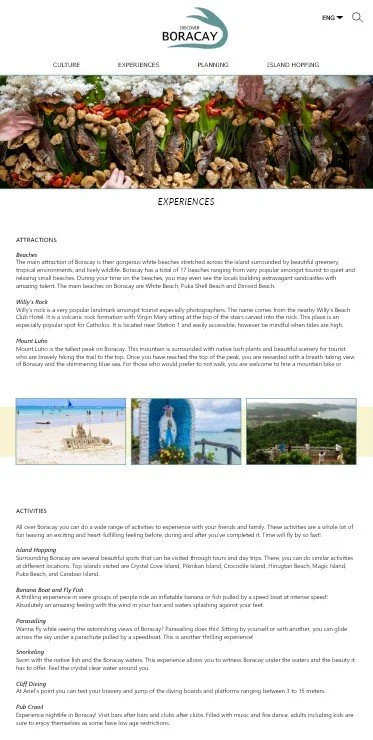
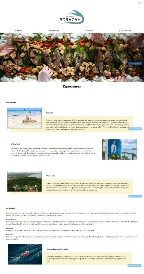
The overall design of the experience page was developed into a page that was more engaging and aesthetic for the user. The design of the mockup was very basic, and feedback received stated that it looked like a simple informational page. They believed more design could make the page more engaging through possibly including the layout of the planning page. By doing this, it makes the website look more uniform and keeps that design consistency. Therefore, changes were made based in user feedback.
Implementing the planning page layout into the experiences page was not so difficult to do. It was decided that three attractions, activities, and food would be changed to the planning page pattern, and the rest would remain the same. Along with the text and images, every other content would have the beachy yellow background for more visual aesthetic and style. It creates visual diversity for the user rather than a simple and boring white page with large paragraphs. It also maintains that consistent website layout, aesthetic, and balance. In terms of responsiveness of the page, making these changes definitely made the website more engaging. Previously, the mobile design was very chunky due to large paragraphs, however this decision to change the layout brings out the website’s style.
Mockup
Prototype
-
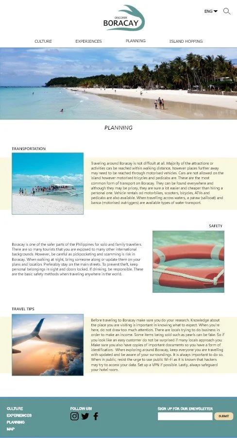
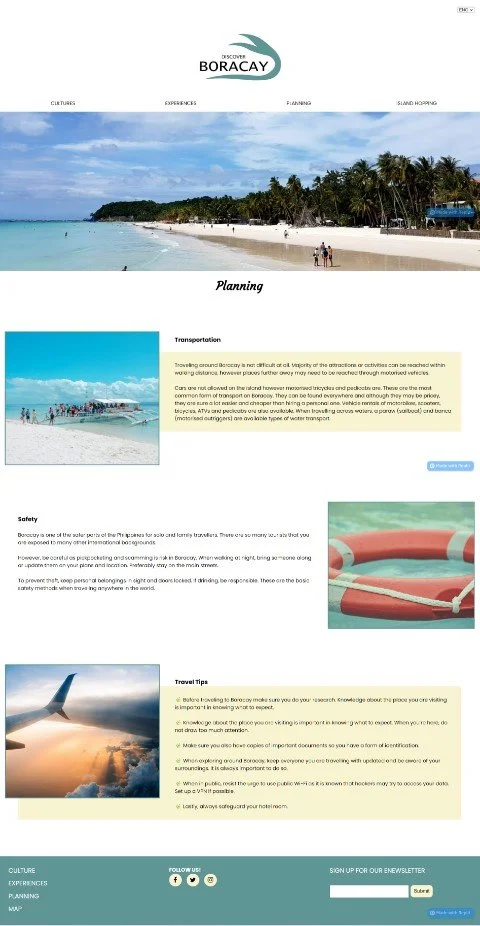
The planning page’s design and development displayed a visually engaging page that provided the website’s consistent aesthetic and layout.
The website’s aesthetic was consistent by maintaining the layout and colour palette. Every other section had a yellow background to add to the visual look of the page. The layout pattern remained as well to keep the page engaging.
The layout and aesthetic of the prototype page was very similar to the mockup page however small edits were made to the page for readability. Feedback provided by users stated that the paragraphs were too chunky which made them hard to read. Therefore, the changes made to the text consisted of breaking the paragraphs into smaller ones and removing unnecessary information. The paragraphs became easier to read, which also resulted in a cleaner layout and style of the page. Extra minor changes included the use of a leaf emoji as the dot points in the travel tip section. The leaf emoji enhances the website’s style and the reference to Boracay’s beaches.
Mockup
Prototype
-
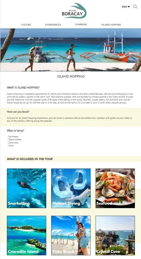
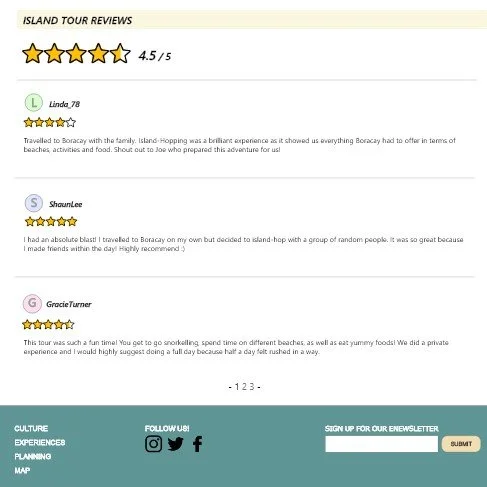
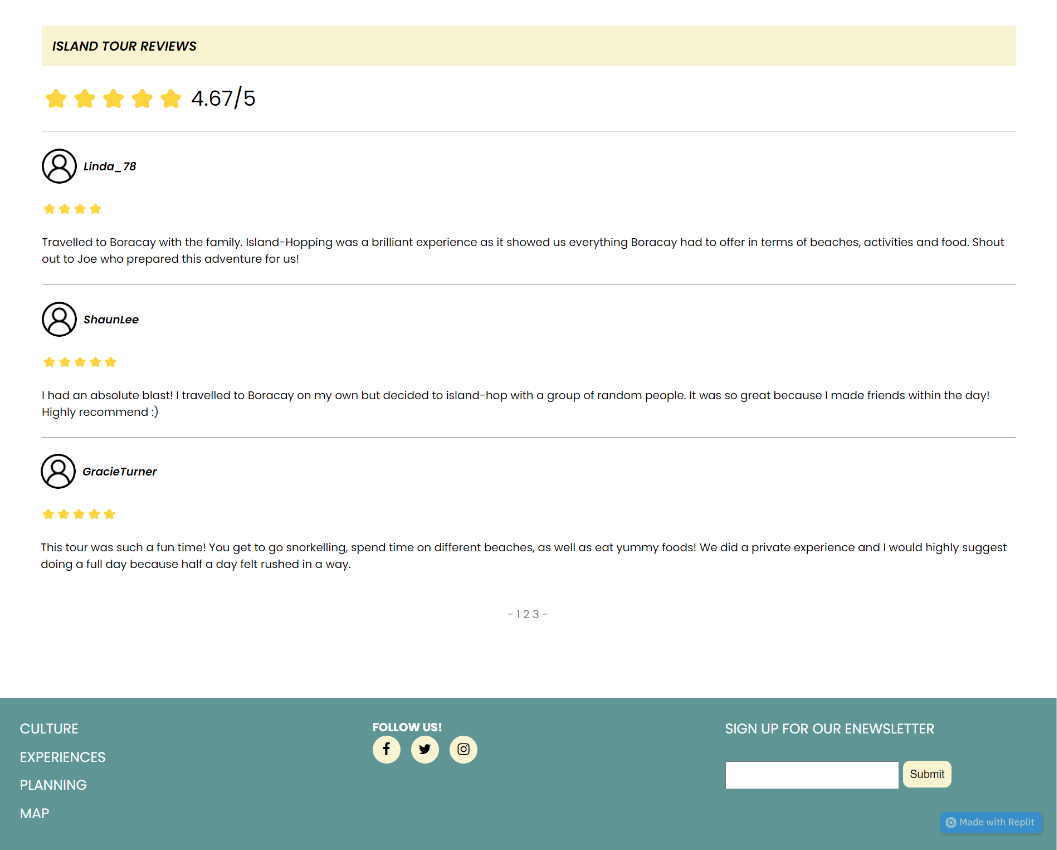
The island hopping page design is the very similar to the other website pages in terms of aesthetic, however the layout differs thoughout the different sections of the body. Since this page mainly focuses on the one activity, the information has been planned in where the user can understand what the activity is, what they need, what is included, and any reviews from previous tourists.
The prototype and the mockup are very much the same as no major changes felt like they needed to be completed from user feedback. The page maintains the website aesthetics while taking in user accessibility and design principles. One design change was the typography of the title and text. This was considered from user feedback in where they asked to experiment with the typography. By doing this, it matched the website’s style and therefore maintained consistency. The page continues to keep a clean visual balance through text size, alignment and spacing.
designs across all pages
When designing the pages for the website, attention to spacing, text size, and alignment was constantly referred to while coding the website. They remained constant across all pages, in where this creates a clearer visual hierarchy and clean visual look for the website and the users using it.
challenges faced
There were many challenges faced across all pages, however these problems were all the same. The home page was the first page worked on, and these problems were solved after constant efforts of problem solving for this page. The main issue was responsiveness of the pages, especially in the header and footer. The coding for the mobile layout was very hard to understand when trying to get the content to move under each other. However, all content in the body is responsive as images and text are moved to the correct layout. Another challenge was making the content presented in the pages more engaging. This was successful through hovering and transition effects.
Discover Boracay Website
As this was made on Replit, you will need a replit account to view the links.